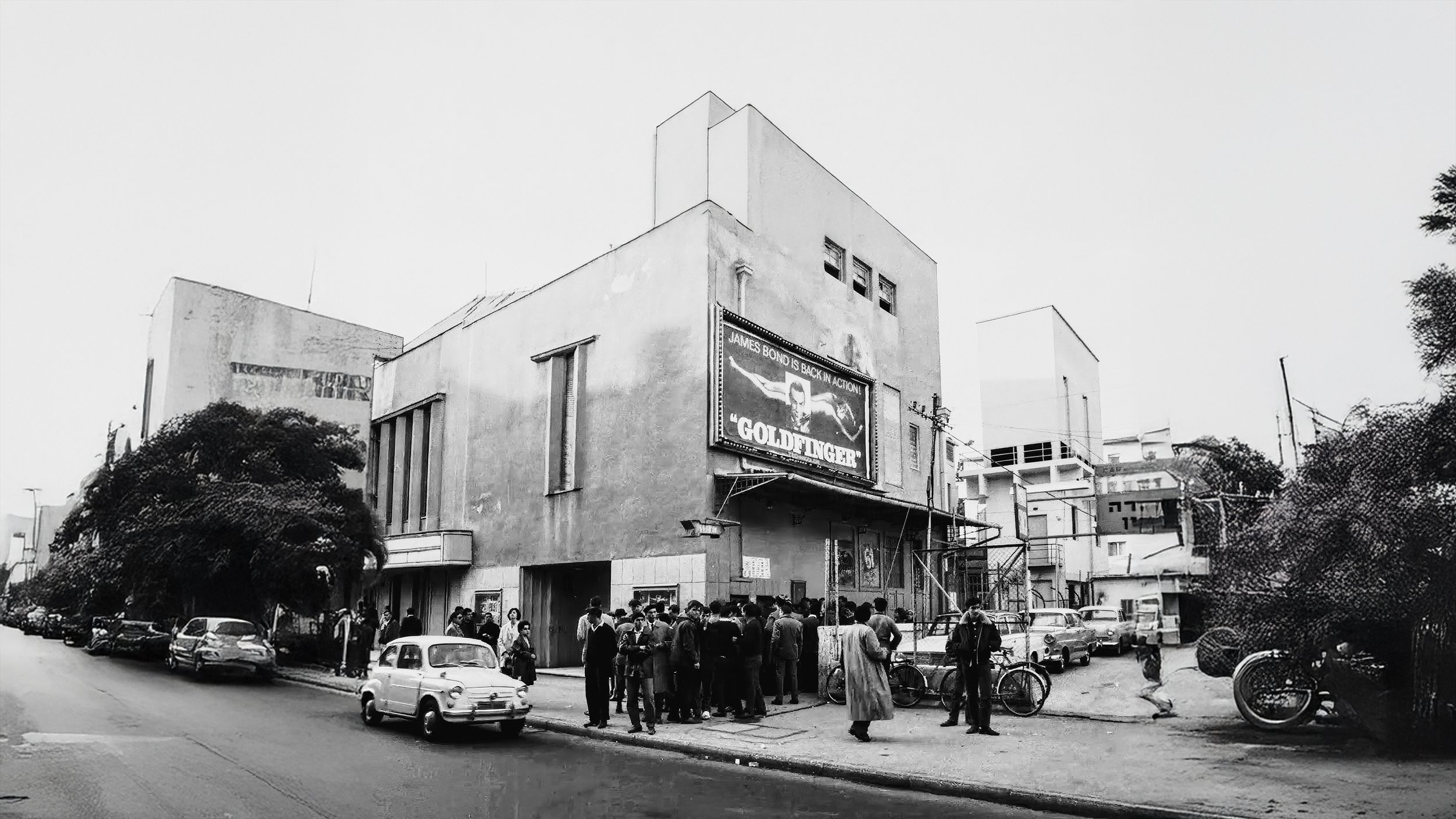
Reimagining Cinema Ophir
A Tribute to Tel Aviv’s Cultural Icon
Honoring the past, inspiring the future through design
This project celebrates the legacy of Cinema Ophir, one of Tel Aviv’s most iconic cinemas. Located on Gruzenberg Street, the cinema was central to the city’s cultural growth in the 1920s and 30s, renowned for its luxurious design and pivotal role in fostering artistic connection. The redesign seeks to honor its historical significance while reimagining its identity with a fresh, contemporary perspective
Design Approach
Typography
The custom typography is inspired by the geometric and Art Deco styles that defined the era when Cinema Ophir first opened. These angular forms convey boldness and innovation, capturing the architectural trends and cultural vibrancy of early Tel Aviv.
Monochromatic Palette
A black-and-white color scheme was selected to emphasize simplicity and elegance. This timeless palette aligns with the visual language of vintage cinema posters and graphics, evoking nostalgia while maintaining modern versatility.
Structure & Symmetry
The structured layout reflects the architectural symmetry of Cinema Ophir’s original building, reinforcing its historical and cultural significance within the city’s landscape.
Challenges
The primary challenge was to modernize the design while honoring the nostalgic elements that made Cinema Ophir an iconic landmark in Tel Aviv’s history. This required extensive research into period-specific typography and design aesthetics, as well as a careful balance between contemporary and retro influences.
Result &
Reflection
Result
The final logo successfully bridges the past and present, capturing the essence of Cinema Ophir’s legacy while presenting a sleek and adaptable identity. The design stands out in both historical archives and modern branding contexts, celebrating its heritage while ensuring relevance for future audiences
Reflection
This project demonstrates the value of context-driven design, where history and modernity intersect to create a unique and meaningful visual identity. It highlights the power of thoughtful research and creative adaptation in honoring cultural heritage through design.
The Posters
The posters were designed to distill each film’s essence into its simplest and most iconic visual representation. By stripping down complex imagery and focusing on symbolic minimalism, the posters aim to evoke an immediate connection to the story or character while maintaining a modern and cohesive style.
each design uses clever visual metaphors to represent the core identity of the film:
• Basic Instinct: The iconic mystery of the film is conveyed through
an abstract yet suggestive visual hint symbolizing the provocative and layered themes of the movie.
• The Dark Knight: A bold “M” with a filled center subtly forms the shape of a bat, capturing the essence of Batman’s dual identity and his shadowy vigilante persona.
• Seven Samurai: The poster features a clean and structured Torii gate symbol, representing both the Japanese setting and the unity of the seven warriors.
• Deadpool: A simple heart symbol with a sharp and playful twist encapsulates Deadpool’s irreverent humor and the unconventional love story at its core.
• Taxi Driver: A structured grid of squares symbolizes a city grid and the confined, intense world of Travis Bickle, while also creating a timeless and universal icon.
• Look Who’s Back: Minimal horizontal lines mimic Hitler’s infamous mustache, evoking the film’s sharp satire and its exploration of identity and history.
This minimalist approach pays homage to the power of storytelling through design. Each poster tells its story without unnecessary embellishments, allowing viewers to engage with the narrative through a fresh, modern lens.


