Intreduction
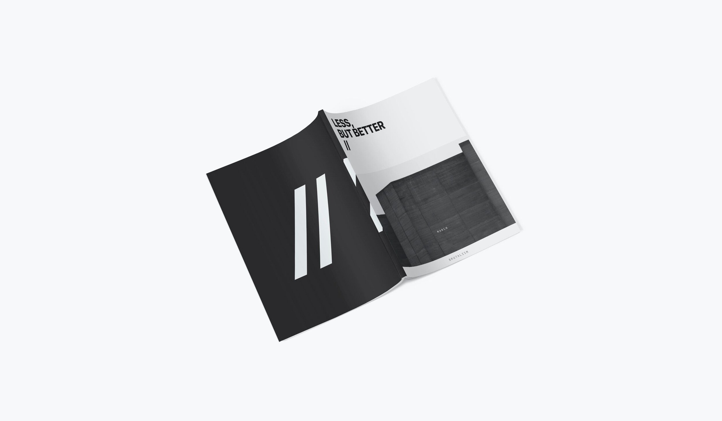
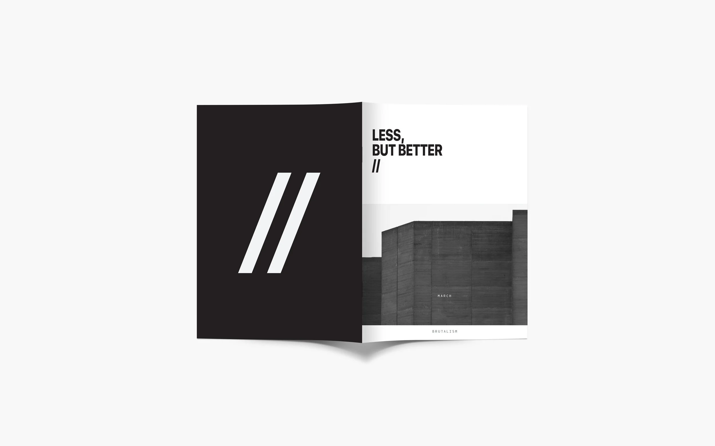
Less, But Better reimagines the architecture magazine by celebrating the raw, controversial allure of Brutalism. Inspired by the minimalist sophistication of Kinfolk and Cereal, this project balances stark simplicity with a modern, stylish aesthetic. The goal was to craft a magazine that not only informs but also resonates visually as a design object in itself.
Design Approach
The magazine’s typography embraces Brutalism’s rigid yet bold identity, paired with a monochromatic palette to echo its raw aesthetic. Careful attention was paid to the layout, balancing generous whitespace with striking imagery to create a sense of calm amidst the chaos.
Content Structure
Each section was carefully structured to reflect Brutalism’s ethos—unapologetically bold yet practical. Features include full-bleed spreads juxtaposed with clean text layouts, allowing the architecture to take center stage.
Reflection
This project underscores my ability to translate abstract concepts into compelling visual narratives. By redefining the architectural magazine genre, I explored how design can amplify and reinterpret controversial aesthetics for modern audiences.


